How to set up canvas size in Photoshop for illustration and concept art for artist and illustrator. Basic tutorial for beginner.
Q: Please can you post someday the way you set up an illustration....for example the canvas size, the layers (rough sketch, detailed line drawing, colour layer etc...) and other main things.
OK, here are the step by step how to set up your illustration and concept art project from the beginning to the end. But really there is no set in stone rules, it's a preference. Each artist has different way of working progress, whatever they are comfortable with.
The BASIC idea of how to determine your image (canvas) size to work with is simple. I usually work 2 or 3 times the FINAL size.
1) Thumbnails stage: You scribble a bunch of idea out within the guideline provided. For example this one is "space marine light-fighter suit"
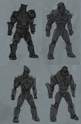
2) I will pick three final design candidates and blow each one of them up to 700 x 500 px. At this stage I will make another layer on top of it so that I can work on the detail a little more and possibly assign quick color and composition. (I believe I always talk about it on the vids)
3) Once I have the basic design with color scheme, I will once again blow it up to 1,400 x 1,000 px. At this stage, I will try to find basic value using layers:
-Overlay (use dark gray if you want darker value, light gray for lighter value)
-Multiply (use local color for darker value only, same apply to dark gray to black.)
-Screen (use local color for lighter value only, same apply to light gray to black.)
Some of you ask me for my background canvas to use
Here is it to download digital canvas background (bigger size)

4) I might use overlay again to accentuate more saturation and hue of some area, especially around the focal point.
5) Once I have these quality in place, I will process to bigger
Check list:
a) Readable Silhouette
b) Lighting (over all value)
c) Color balance
d) Big detail
e) composition that have define focal point
*Once you have all that goto 6)
6) I again enlarge the image for the last time to abour 2,400 x 2,000 or bigger
**(traditionally, whenever you enlarge the image, you are basically re-draw, re-paint and reproduce the whole picture. Thanks to digital ages.)
***(for printing purpose if that apply, should consider a size of the assignment and set it at 200-300 dpi/inch.) I have never yet work on anything that is bigger than 3,500px and up. The bigger it is the better the quality, but keep in mind that it means more area you have to work on.
TIPS: Once your image is big, lot of beginners tend to zoom in 100% and work on little detail. Don't do that unless you must. It will deceive you when you zoom in. Constantly check the overall value of the whole image and color balance by zoom out. Check thumbnail often.
Below is my character concept for GuildWars 2

7) At this final size, I rarely use any special layers. There is no need because before you get there, you should already have all or most of the value you need to achieve the final illustration. Just paint on the actual layer or normal layer. I keep painting over using the establishing value and color until it's finish.
*Tips: think clean up and simplify, not adding more.
8) Final touch up stage: I might add hot spot or increase color saturation here and there around the focal or necessary area.
FOR WEB PUBLISHING
I usually base the format sizing on standard paper or illustration sizes are 5x7, 9x12, 11x14, 11x17 inches. Then I set it at the 72 dpi. So if my final size is 9x12 at 72 dpi resolution, I will have to work 2 times bigger.
So it would be
18 x 24 at 72 dpi
or
9 x 12 at 144 dpi
FOR PRINT, this will required a higher resolution.
I usually base the format sizing on standard paper or illustration sizes are 5x7, 9x12, 11x14, 11x17 inches. Then I set it at 200 dpi. (200 to 300 dpi is best for printing resolution)
So if my final size is 9x12 at 200 dpi resolution, I will have to work 2 times bigger.
It would be
18 x 24 at 300 dpi
or
9 x 12 at 600 dpi
Hope that make sense,
Peace!
CHECK OUT our full length PREMIUM video tutorials

Art resource:
-How to pick pencils for drawing
-5 tips to improve drawing skill for artist.
-Basic Color Scheme for Artist, Monochromatic.
-Color temperature warm vs cool for artist.
-Basic Element of good design for artist.
Photoshop technical tutorials:
-Basic Photoshop How to use tools for artists
-Set up your Wacom Tablet and brushes
-How to make Photoshop custom palette
-Photoshop short cut, hot keys for artists
Q: Please can you post someday the way you set up an illustration....for example the canvas size, the layers (rough sketch, detailed line drawing, colour layer etc...) and other main things.
OK, here are the step by step how to set up your illustration and concept art project from the beginning to the end. But really there is no set in stone rules, it's a preference. Each artist has different way of working progress, whatever they are comfortable with.
The BASIC idea of how to determine your image (canvas) size to work with is simple. I usually work 2 or 3 times the FINAL size.
1) Thumbnails stage: You scribble a bunch of idea out within the guideline provided. For example this one is "space marine light-fighter suit"

Or some environmental thumbnails


Usually at this stage I work really small. On 9 x 12 sketch page, I could fit in about 12 of these figures (three on each roll with four rolls vertical.). Or in Photoshop, I would create 350 x 500 px canvas. Then I fix four of them as shown above.

2) I will pick three final design candidates and blow each one of them up to 700 x 500 px. At this stage I will make another layer on top of it so that I can work on the detail a little more and possibly assign quick color and composition. (I believe I always talk about it on the vids)
3) Once I have the basic design with color scheme, I will once again blow it up to 1,400 x 1,000 px. At this stage, I will try to find basic value using layers:
-Overlay (use dark gray if you want darker value, light gray for lighter value)
-Multiply (use local color for darker value only, same apply to dark gray to black.)
-Screen (use local color for lighter value only, same apply to light gray to black.)
Some of you ask me for my background canvas to use
Here is it to download digital canvas background (bigger size)
4) I might use overlay again to accentuate more saturation and hue of some area, especially around the focal point.
5) Once I have these quality in place, I will process to bigger
Check list:
a) Readable Silhouette
b) Lighting (over all value)
c) Color balance
d) Big detail
e) composition that have define focal point
*Once you have all that goto 6)
6) I again enlarge the image for the last time to abour 2,400 x 2,000 or bigger
**(traditionally, whenever you enlarge the image, you are basically re-draw, re-paint and reproduce the whole picture. Thanks to digital ages.)
***(for printing purpose if that apply, should consider a size of the assignment and set it at 200-300 dpi/inch.) I have never yet work on anything that is bigger than 3,500px and up. The bigger it is the better the quality, but keep in mind that it means more area you have to work on.
TIPS: Once your image is big, lot of beginners tend to zoom in 100% and work on little detail. Don't do that unless you must. It will deceive you when you zoom in. Constantly check the overall value of the whole image and color balance by zoom out. Check thumbnail often.
Below is my character concept for GuildWars 2
7) At this final size, I rarely use any special layers. There is no need because before you get there, you should already have all or most of the value you need to achieve the final illustration. Just paint on the actual layer or normal layer. I keep painting over using the establishing value and color until it's finish.
*Tips: think clean up and simplify, not adding more.
8) Final touch up stage: I might add hot spot or increase color saturation here and there around the focal or necessary area.
FOR WEB PUBLISHING
I usually base the format sizing on standard paper or illustration sizes are 5x7, 9x12, 11x14, 11x17 inches. Then I set it at the 72 dpi. So if my final size is 9x12 at 72 dpi resolution, I will have to work 2 times bigger.
So it would be
18 x 24 at 72 dpi
or
9 x 12 at 144 dpi
FOR PRINT, this will required a higher resolution.
I usually base the format sizing on standard paper or illustration sizes are 5x7, 9x12, 11x14, 11x17 inches. Then I set it at 200 dpi. (200 to 300 dpi is best for printing resolution)
So if my final size is 9x12 at 200 dpi resolution, I will have to work 2 times bigger.
It would be
18 x 24 at 300 dpi
or
9 x 12 at 600 dpi
Hope that make sense,
Peace!
CHECK OUT our full length PREMIUM video tutorials
Art resource:
-How to pick pencils for drawing
-5 tips to improve drawing skill for artist.
-Basic Color Scheme for Artist, Monochromatic.
-Color temperature warm vs cool for artist.
-Basic Element of good design for artist.
Photoshop technical tutorials:
-Basic Photoshop How to use tools for artists
-Set up your Wacom Tablet and brushes
-How to make Photoshop custom palette
-Photoshop short cut, hot keys for artists
-Photoshop tips, using multiply mode.
-Making custom brush in Photoshop, pencil brush.
-FREE Photoshop Brushes Download
-Making custom brush in Photoshop, pencil brush.
-FREE Photoshop Brushes Download
Basic lessons on how to constructed (draw) a face. Then these tutorial will guild you to a basic how to: How to draw lesson girl face, How to draw person head basic. And digital painting tutorial rogue samurai female. As for the face or head (women, female) Draw girl's face how to lesson video and step by step and learn how to draw face, woman. Enjoy the video tutorials.
More superheroes drawing video tutorials go How to draw Fantastic 4 Susan Storm (basic comics style drawing with pose) and watch How to draw comics superhero spiderman, and my How to draw comics character Hulk, it also has coloring or paint over tutorial. Also the new arrival video tutorial, How to draw Captain America. And an older video tut, How to draw Batman or Darknight.


